OIC
Client: Orion Infrastructure Capital (OIC)
Orion Infrastructure Capital
UX Design, Visual Design, Motion Graphics, Branding
Outcast partnered with the Orion to rebrand its messaging and visual identity and solidify its position as a leader in the sustainable investment space. Originally Orion Energy, newly minted Orion Infrastructure Capital (OIC) is a leader in the mid-market infrastructure space. The rebrand and new functional website bolstered OIC out of a crowded infrastructure investment space.

The Problem
Orion Energy (now OIC) wanted a total do-over. Name change, branding update, and in that bundle, a new website to tie it all together. We needed a solution that stayed recognizable in the sustainable innovation VC space but also launched the new brand.
The Solution
We completely restructured the site in order to highlight brand story and emphasize OIC’s ethos. The new branding design was also applied in order to fully take OIC’s new site into the sustainable future.
Restructured sitemap and user flow
Visual design and brand overhaul
Added interaction elements
Research
After receiving a brief, our team conducted research in order to align client expectations and also uncover any underlying desires for the site. As this is a niche investment space, we had a lot of learning to do about the industry as a whole in order to better understand who would be coming to the site and why. We needed to tread carefully and stray away from being “buzzwordy” and not telling OIC’s story in a meaningful and impactful way. In order to do this properly, we conducted research to figure out specifically who OIC thinks they are, and where they stand in the small competitive space.

Competitor Audit
Sustainable and environmental innovator funding is a niche space, so it was incredibly important to compare what other sites in the space were doing. We analyzed site structure, usability, language used (buzzword detection, really), and company narrative presence.

Stakeholder Interviews
We asked several questions about what the goals of the site were, site visitors and reasons for their visits. Through these interviews we wanted to align on site goals. One of the primary goals we uncovered was that the site was more of a tool for OIC to use and point to during partnership talks, so getting the story and ethos of the brand upfront was important.
OIC previously was feeling buried due to their name (Orion Energy) not being as unique as they’d like.
The old branding didn’t have any of the personality that OIC was looking for.
It was less important to highlight specific brands, and much more important to highlight specific sectors that OIC funded.
Discovery
After preliminary research, we broke down the site goals in terms of audiences and site functions. We asked, “What are the audience’s goals? How might they achieve them?” And this exercise helped plot out the site architecture and eventual wireframe structure of the site. We prioritized and re-prioritized pages and sections, and were in constant talks with the client during this part of the process to ensure that the brand story was being told in the way they wanted it to be told, while still ensuring site usability for all users.

Our research netted out a couple of different audiences that visit the site. While there was a lot of overlap between the goals of different audiences, there were a couple of unique identifiers per group that necessitated some site restructuring. We needed to highlight OIC’s environmental responsibility ethos as well as show off their portfolio breadth.
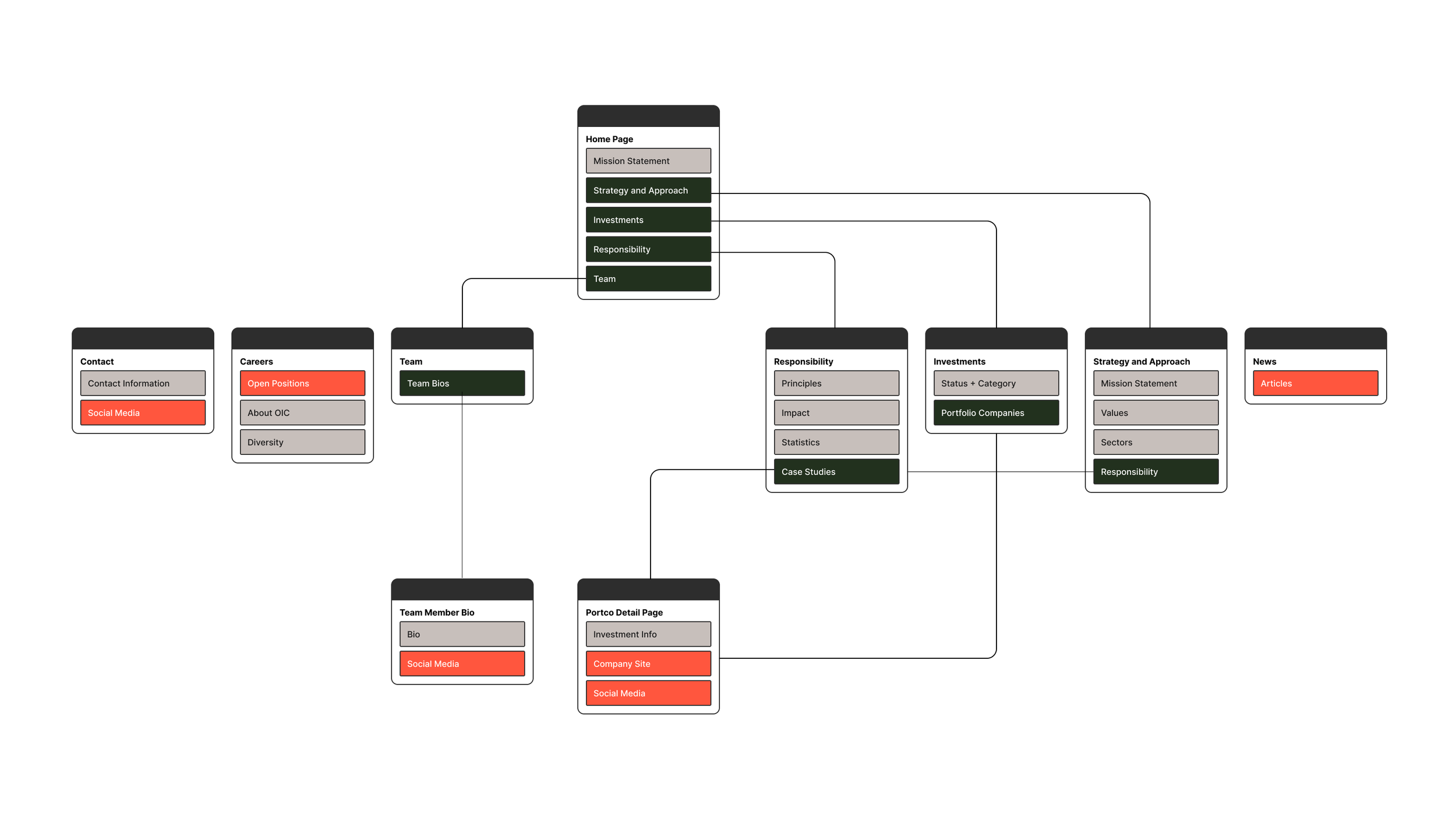
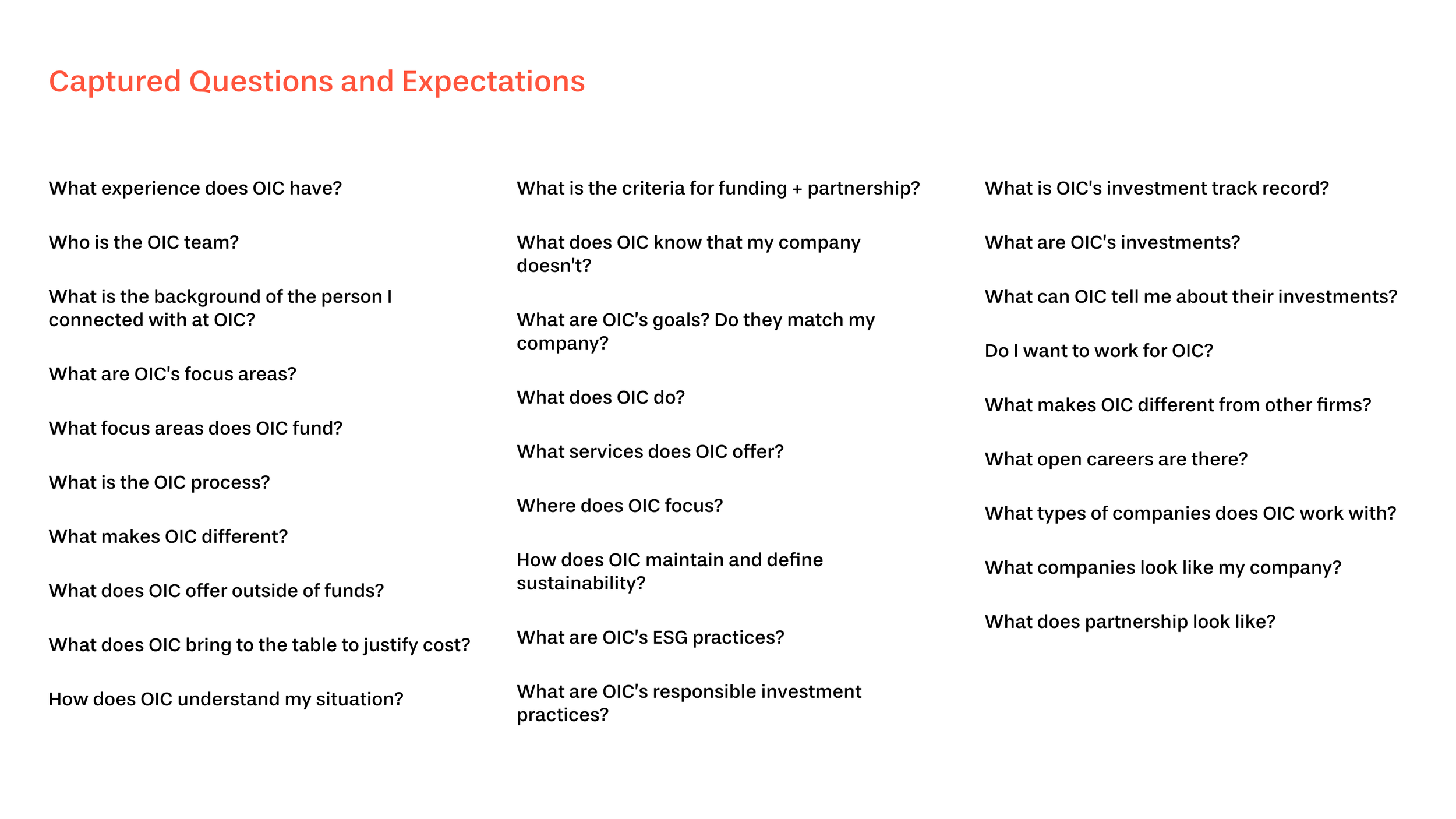
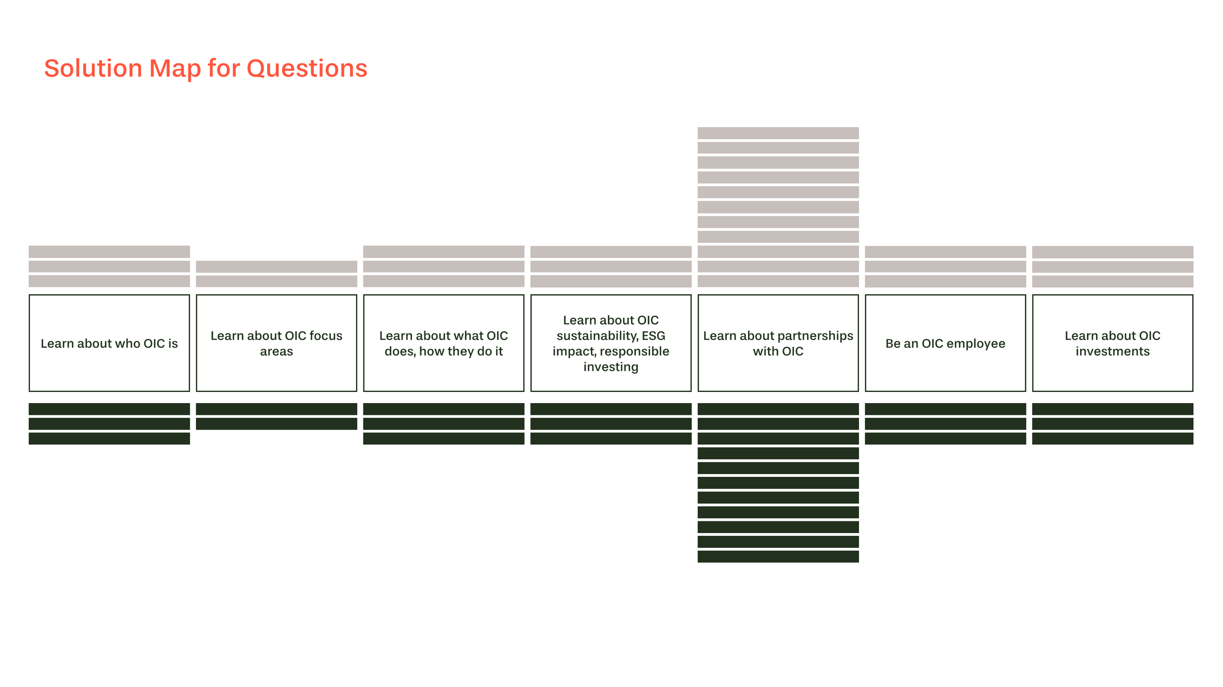
We took our findings from the stakeholder interviews and listed out all possible expectations and questions a site visitor would have arriving at the OIC site. After all questions were listed, we made an affinity map of the questions and these groupings netted out our top-level structure for the sitemap. We also mapped out solutions to all possible questions to ensure that each page would contain the necessary information to answer each question/goal.
Define
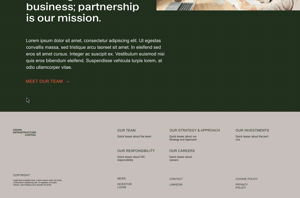
After reviewing and revising the sitemap, we began iterating on the site structure and visual design. As this was an entirely new brand identity, we based the visual design and overall layout of the site on the new brand guidelines, while still maintaining web and mobile usability. We injected more color and relevant photography to keep the brand narrative thread present throughout all pages. The previous site did not provide much visual feedback while going through, so we also included an interaction overhaul as well that matched the brand. We went through several site iterations as the new brand was solidifying.

Sketch to hi-fidelity
Developing site structure and developing visual style happened at the same time. After landing on the most successful site structure iteration, we applied the updated visual styling. Having the two work streams helped cut down on time, but we still had to iterate the higher fidelity prototypes in order to match form with function just right.


Outcomes
OIC’s new site saw an increase in press, sessions, and inquiries right out of the gate. But most importantly the insights and story of who OIC is and how they work is showcased. The final website is a result of simplifying out a complex and multi-faceted narrative into organized and manageable sections.
Contributors